
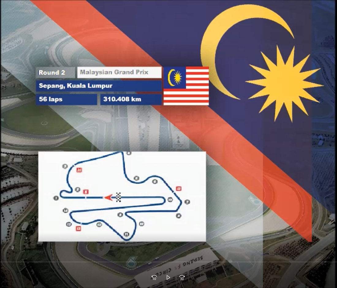
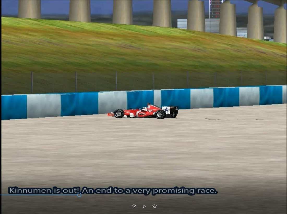
 Since the series inception in 2013, Formula Virtual has gone through many broadcasting styles in it's eight year history. Intro's, grid graphics, in race graphics, and music has all changed. Let's take a look back and remember what once was. 2013 Formula Virtual announced itself to the world in 2013 as a fun and competitive racing series. It was clear to see how new it was, especially comparing the graphics back then to what we have today. Each race began with the tune of 'Crescendolls' by Daft Punk with the series logo simply showing in the background. The track map, grid, race results, and championship standings all shared the same style which consisted of slanted red, white, and blue blocks over a carbon fiber background. The in-race graphics simply had red text on screen in lieu of commentary. No lap counter was shown.
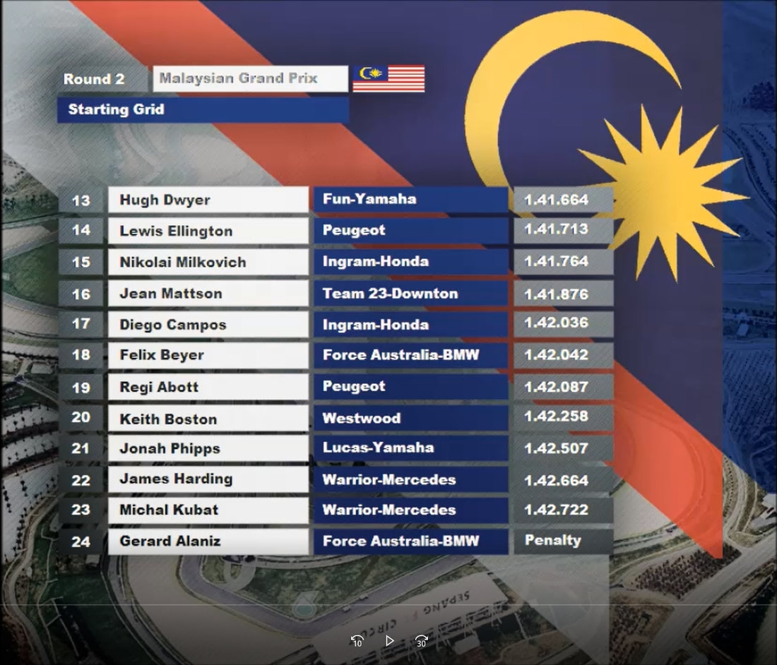
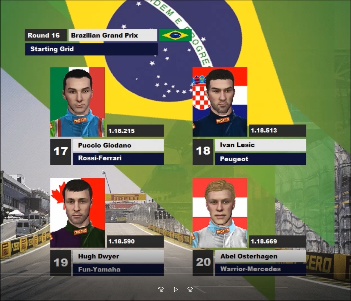
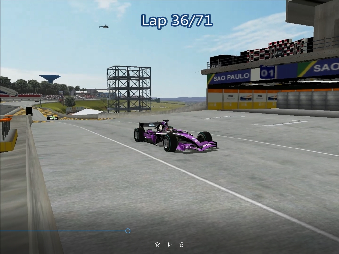
2014 'Propane Nightmares' by Pendulum opened up every race during the 2014 season accompanied with a montage of the previous 2013 season. Numerous other songs played at different races after the initial opening titles. The series logo was then shown in front of the countries flag which was hosting the race, along with the track itself. The track map, results, and championship standings all shared the same style, but this time with a more block like style and with a nicer background. The in-race graphics now had blue text in lieu of commentary with again no lap counter. However mid way through the season commentary was introduced. This meant the text commentary was no more and a lap counter was introduced. The grid graphics was also changed to incorporate driver images.
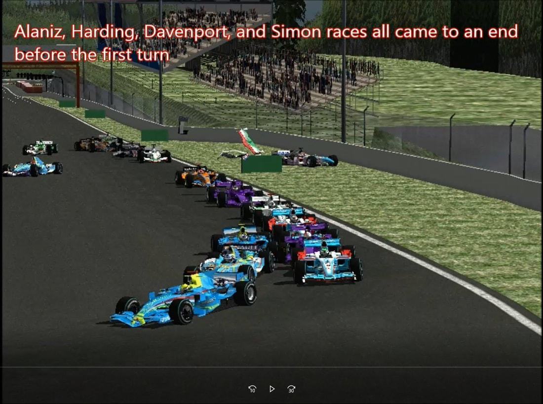
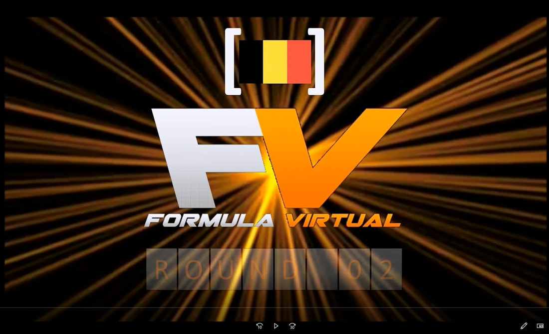
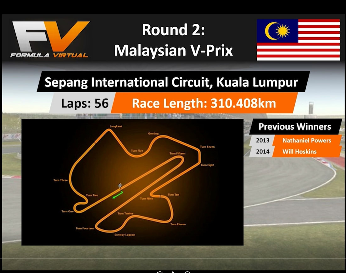
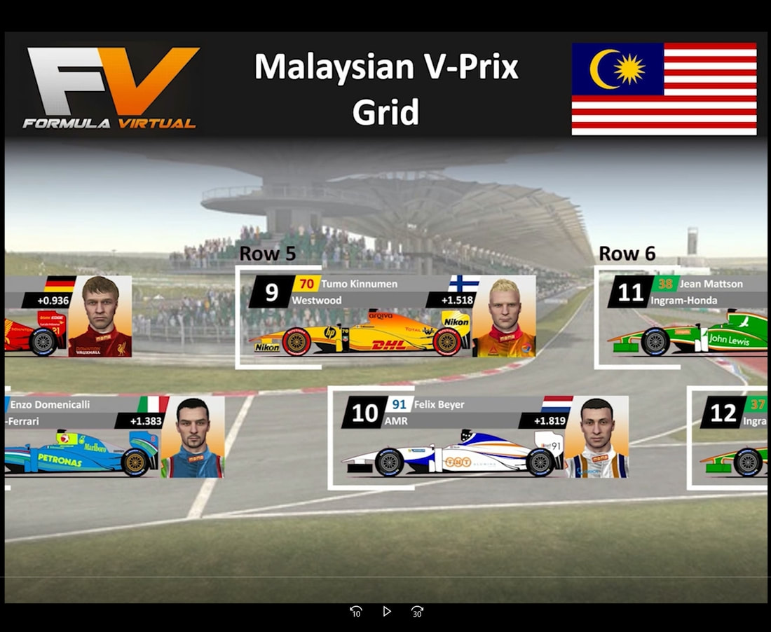
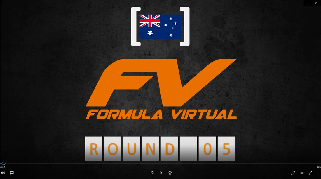
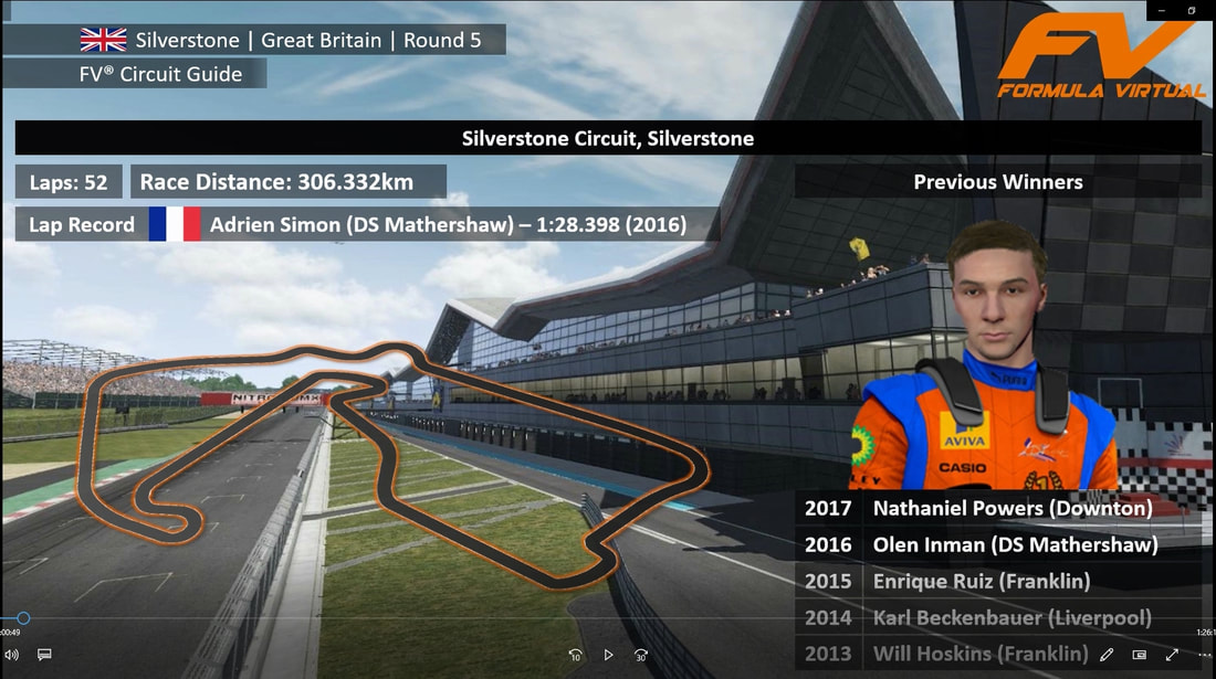
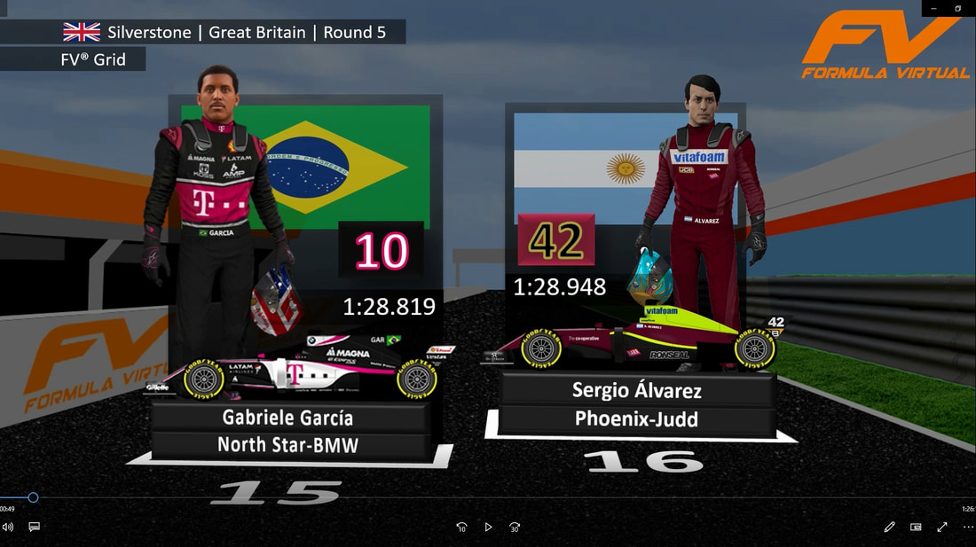
2015-2017 Formula Virtual incorporated it's own music into the intro and grid sequence, which was created by Ryan Peterson. The intro ended with the series logo and country flag in front of a black and orange background. It was also accompanied by zooming out of the reigning champions car. Orange, black, and grey were the theme being used for the track map, grid, results and championship standings. The grid and constructor standings graphics incorporated the drivers cars. The in-race graphics received a big update, which included horizontal scrolling race standings and timings, and also sector flags.
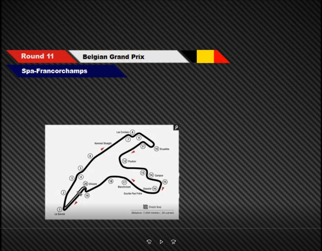
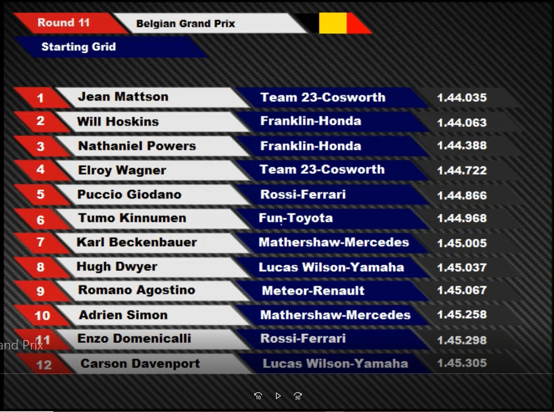
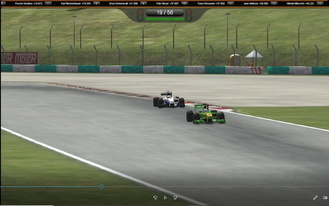
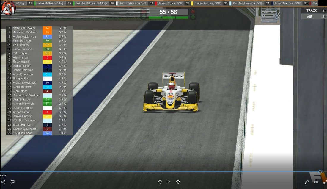
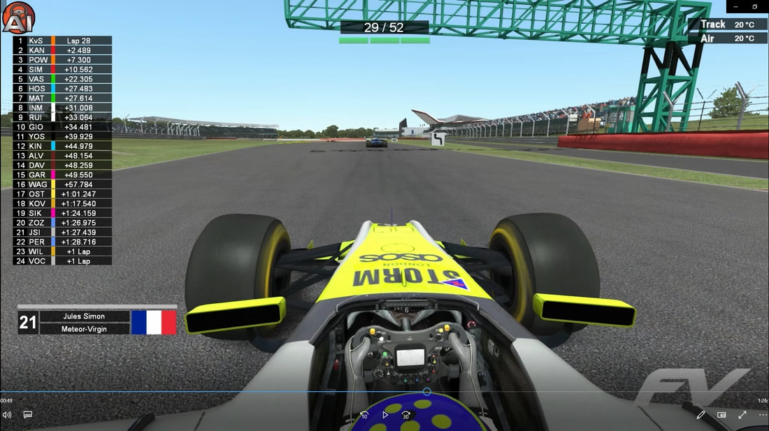
2016 and 2017 did change slightly from 2015. The only change was the in-race graphics. The horizontal scrolling banner remained, however was now on a grey background. A tower was also introduced which included the race standings and gave data such as number of pit stops made. Teams also had a unique color which was also used to help fans tell the drivers and teams apart. Track and air temperature was displayed. The series logo was also used in the bottom right.
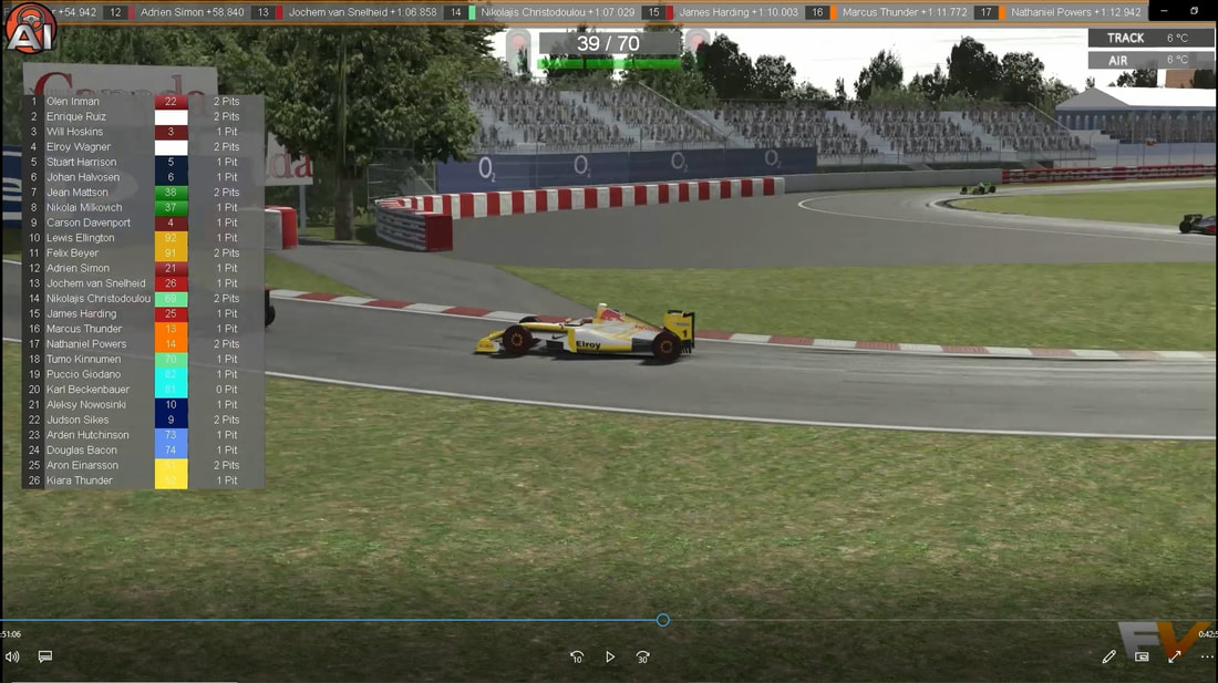
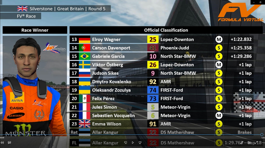
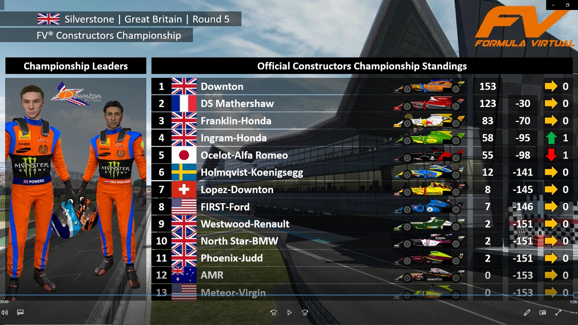
2018-2020 The graphics and overall broadcast were overhauled drastically. The intro music was changed but was still composed by Ryan Peterson. The intro ended on the series logo above a black patterned background, but used the same animation which has been used since 2015. The overall design of the graphics used black and clear blocks. The grid graphics were changed with the drivers full body shown with their race helmets. The in-race horizontal scrolling banner was removed, with just the standings tower remaining. A pop up would also come on screen letting the viewers know which driver they were watching.
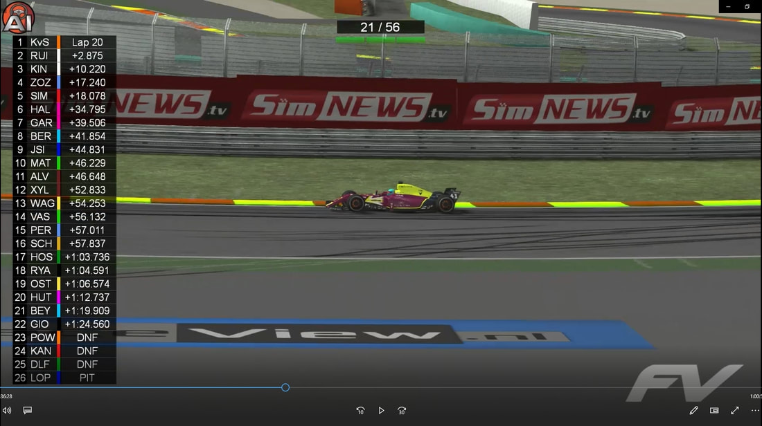
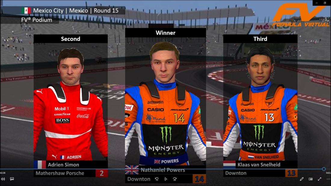
From 2019 the in-race graphics changed slightly with the standings tower now much larger. The air and track temp was also removed. For 2020 a podium graphic was introduced and played at the end of every race.
0 Comments
Leave a Reply. |
|
 RSS Feed
Photos from Digital Aesthetica, tjuel
