
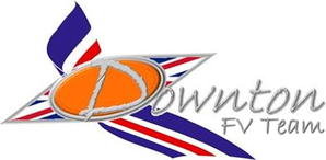
 Downton have unveiled a new logo for next season's Championship, following the change of team name from 'Downton F1 Team' to 'Downton FV Team'. The logo will be the team's third different one in the three season's they've been competing, but Downton was keen to explain why. 'It's no secret I've struggled with finding a logo I'm happy with,' Downton commented. 'I want to show our colourful playful side, honour our British heritage, advertise our brand, and therefore have a serious side too.'
'I've always tasked myself with designing a logo including all of these features, and by the deadline for entries I've never had something I'm really proud of. This year, it was suggested I ask around to see if anyone else could do a better job and so I did.' 'This logo has actually been designed by new Ocelot boss Rai Miyamoto, and I want to be the first to say I think it's incredible. It's everything we want and different from the usual square logo's we get. I am very please with it.' One thing noted of the new logo was the lack of 'Downton Sky Blue' and increased inclusion of the colours of the British flag. When asked if this suggested a hint towards a change in livery Downton was very coy. 'The colours of our car have become iconic and stand out beautifully. That's not to say we're not looking at change however, although we may well keep it similar. I'll tell you this, you'll find out soon. We're looking at unveiling it not long after we return from Mexico.'
0 Comments
Leave a Reply. |
|
 RSS Feed
Photos from Digital Aesthetica, tjuel
